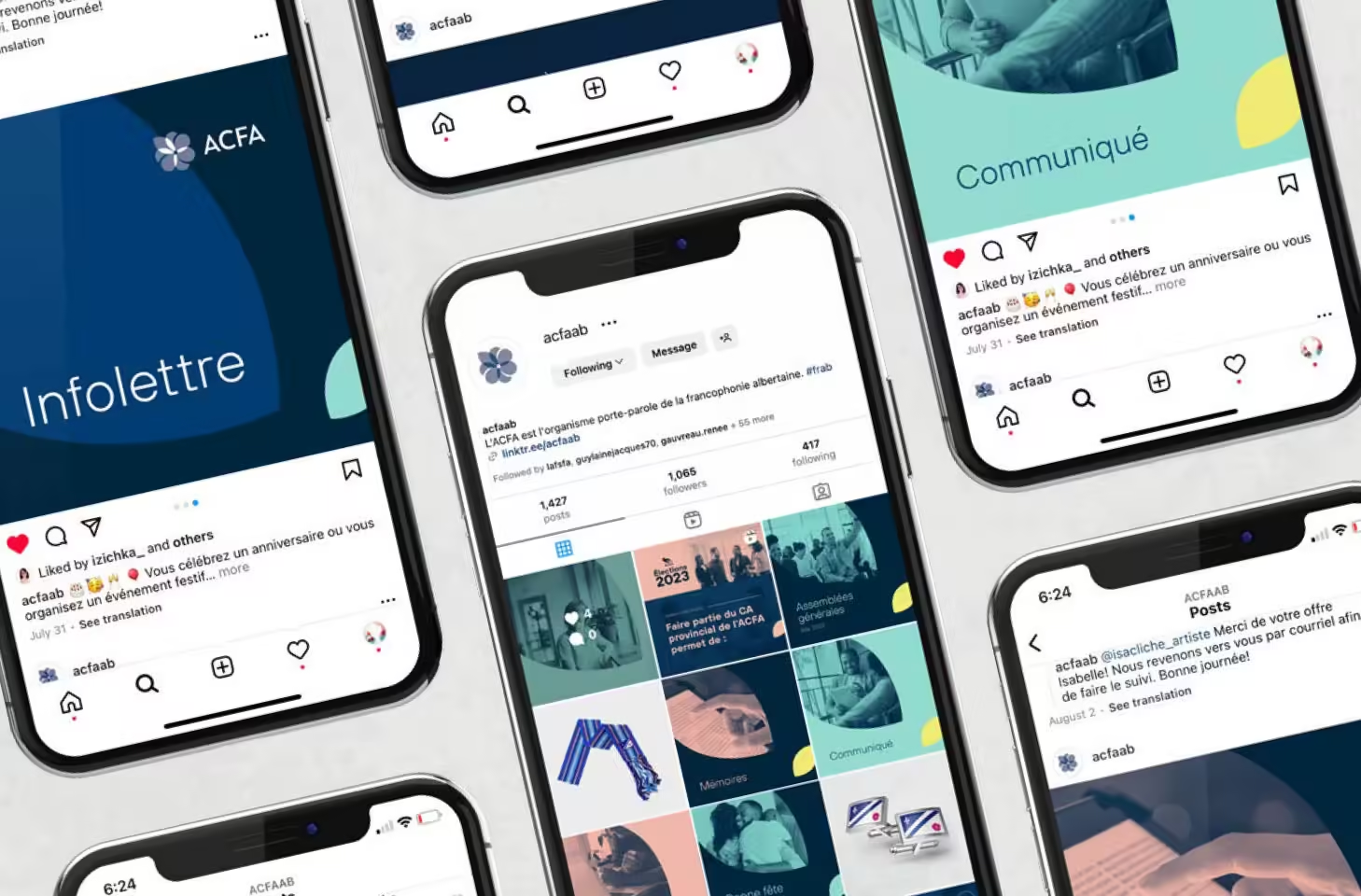
Fun fact: The human eye can physically perceive millions of colours, but we don’t all recognize or value these colours in the same way.
Why?
Sometimes because of differences in physical abilities. Sometimes because of cultural differences or language.
In our line of work, however, colour perception is crucial. When it comes to graphic design, it’s our role, as artists and experts, to make you understand how colours can work for you, specifically to strengthen your brand and make you gain market shares.
THE PSYCHOLOGY OF COLOURS
The human ability to see and perceive the surrounding world has always been the object of physical, medical and even philosophical researches. A branch of these theories led to the widespread notion of symbolism of colours. Indeed, colours are supposed to affect the viewers a certain way. Particular colour schemes are believed to make us feel a certain way.
For instance, red is generally associated with warmth and energy, blue with relaxation and serenity, yellow with optimism, and so on.
When it comes to brand awareness, colours need to be carefully chosen, because they will influence the said viewers, turning them into potential customers. For any creative print design and marketing ideas, the right use of colours aims to create an emotional response, because it’s the first thing people see.
So, coming back to the above mentioned examples, designers can use red to project confidence or boldness in a brand. If we choose a darker blue, it’s because customers perceive it as being very professional, very serious and trustworthy. Spots of yellow might indicate that your business or organization is all about a positive attitude.
The world of illustrations and image development is more complex of course, but professionals like us, at Creative Coco’Nuts, will always choose the perfect colours to represent your brand and convey the right message, almost at an unconscious level for your audience.
WORKING WITH COLOURS
We’ve already talked about the difference in human perception when it comes to colours. Now just think about adding technology in the mix!
Are colours going to appear the same on the screen of a computer and in “real” life? Maybe not.
When you buy something on line, the colours are vibrant… because the objects are in 2D and essentially lighted from within the monitor. The colours that you see online have dreamy names like “Cherry Blossom” or “Ocean Mist”. But when you receive your product, you can often be disappointed, because the colours don’t “glow” anymore – 3D will just do that.
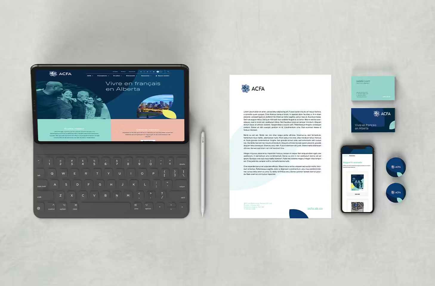
We at Creative Coco’Nuts know that consistency between digital and print is paramount. It will never be exactly the same, because of the difference between “virtual” (what you see on the screen) and “real” (what you hold in your hands), but we use different methods to make sure that the original idea and the final product are consistent.
When we show you your brand new vehicle wrap, poster, flyer, brochure or business card layout on a screen, it will be in the colour model RGB (red, green and blue). What we need to send to the printer, though, is in the colour model CMYK (cyan, magenta, yellow and black), because that’s how printers print, period. There are obvious differences between the two models. We further try to get the best possible match by working with the Pantone Matching System, which is THE standard when it comes to printing.
The Pantone Matching System (PMS) uses a numbering system to identify over a 1,000 colours. In our line of work, we essentially use it to avoid colours variances between different types of print and digital media.)
Despite all those well-known methods, the colour match is never guaranteed when it comes to print. Bringing 2D to 3D means that we’ll be using different stock, paper or fabric, which will likely influence the final result. That’s why we always want our customers to see a print proof of their project. You have the final say, no matter if you’re not a colour specialist or feeling a bit overwhelmed by all the possibilities of the colour spectrum.
No worries, we’ve got the eyes! We’ve been in the industry long enough to find the perfect graphic solutions for you, as well as your brand’s true colours.


