Today, flexibility in website design is key. Your customers are looking up your site on their phones while they’re on the go, on their iPads while they’re watching Netflix, on their laptops while they’re at work.
It’s essential that your website is able to adapt to fit your customers’ needs. This is where responsive web design comes in.
What is responsive web design?
 Putting all your content into one textbox and slapping a few pictures on the side just doesn’t work anymore. When viewed on different devices, the text will either be squished and unreadable, or spread out with too much blank space.
Responsive web design allows the content of your site to adapt and fit the screen sizes, orientation, and image resolution of the device your customers are using.
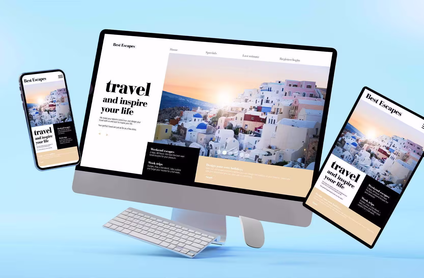
For example, a website layout with three different columns of text would be adjusted to be a single column of text for mobile view. The font size would be larger, and any images would appear below the text, not off to the side like on desktop view.
Responsive web design eliminates the need to design a new website layout for every new device, which would be costly and time consuming, and it makes sure that your website will automatically adapt to fit user preferences.
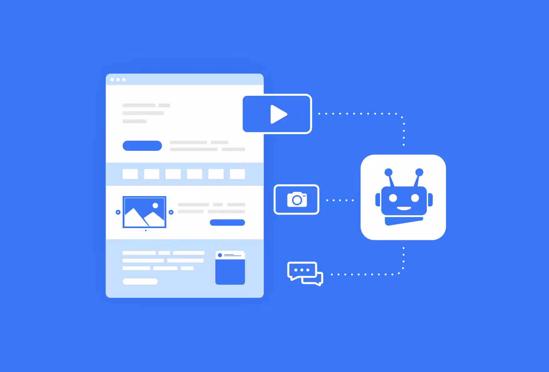
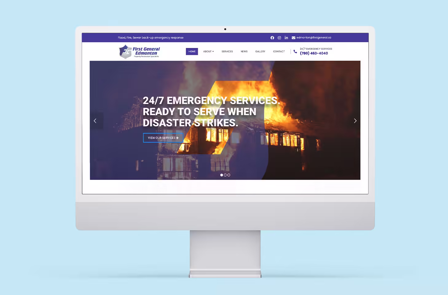
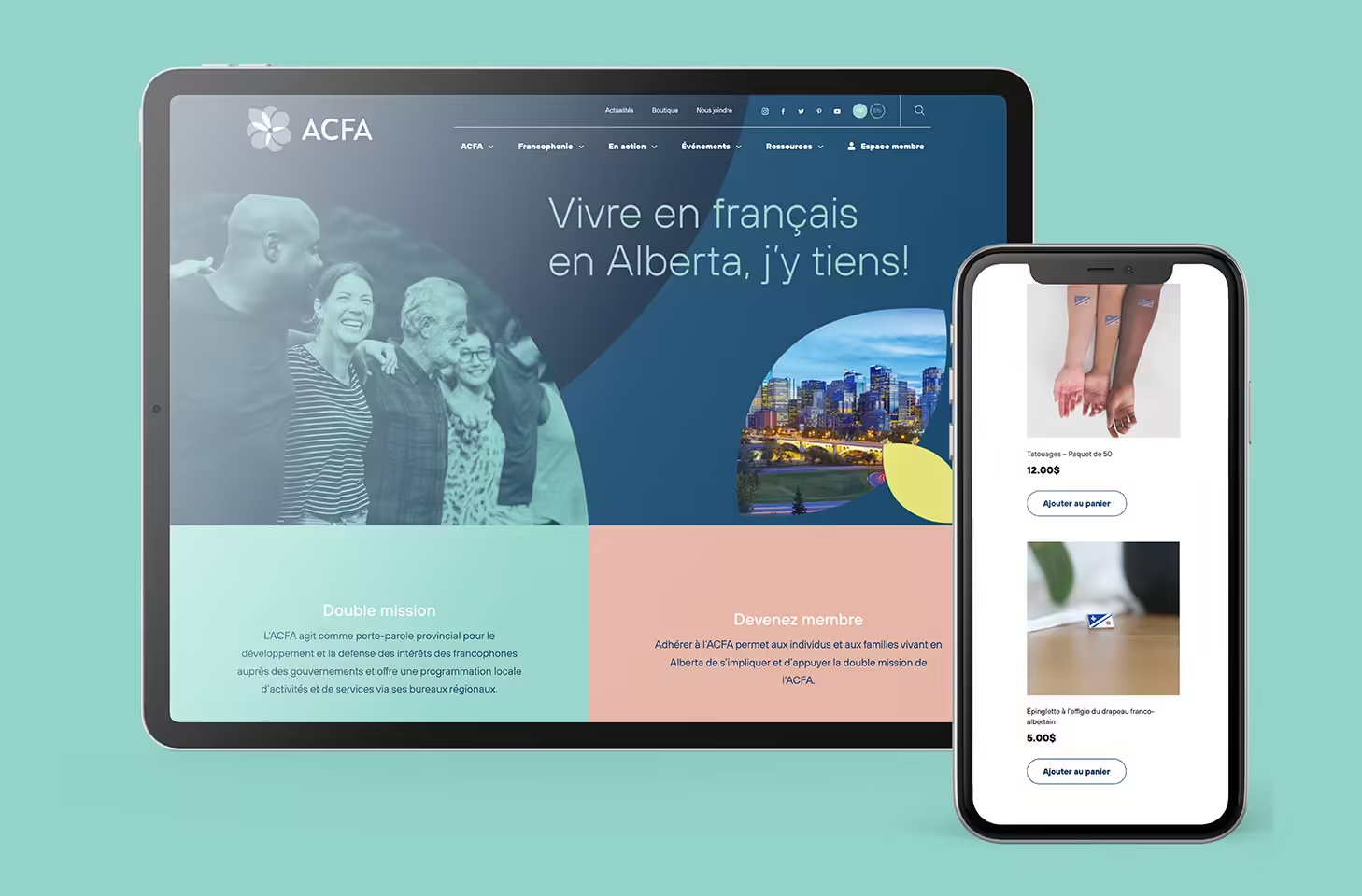
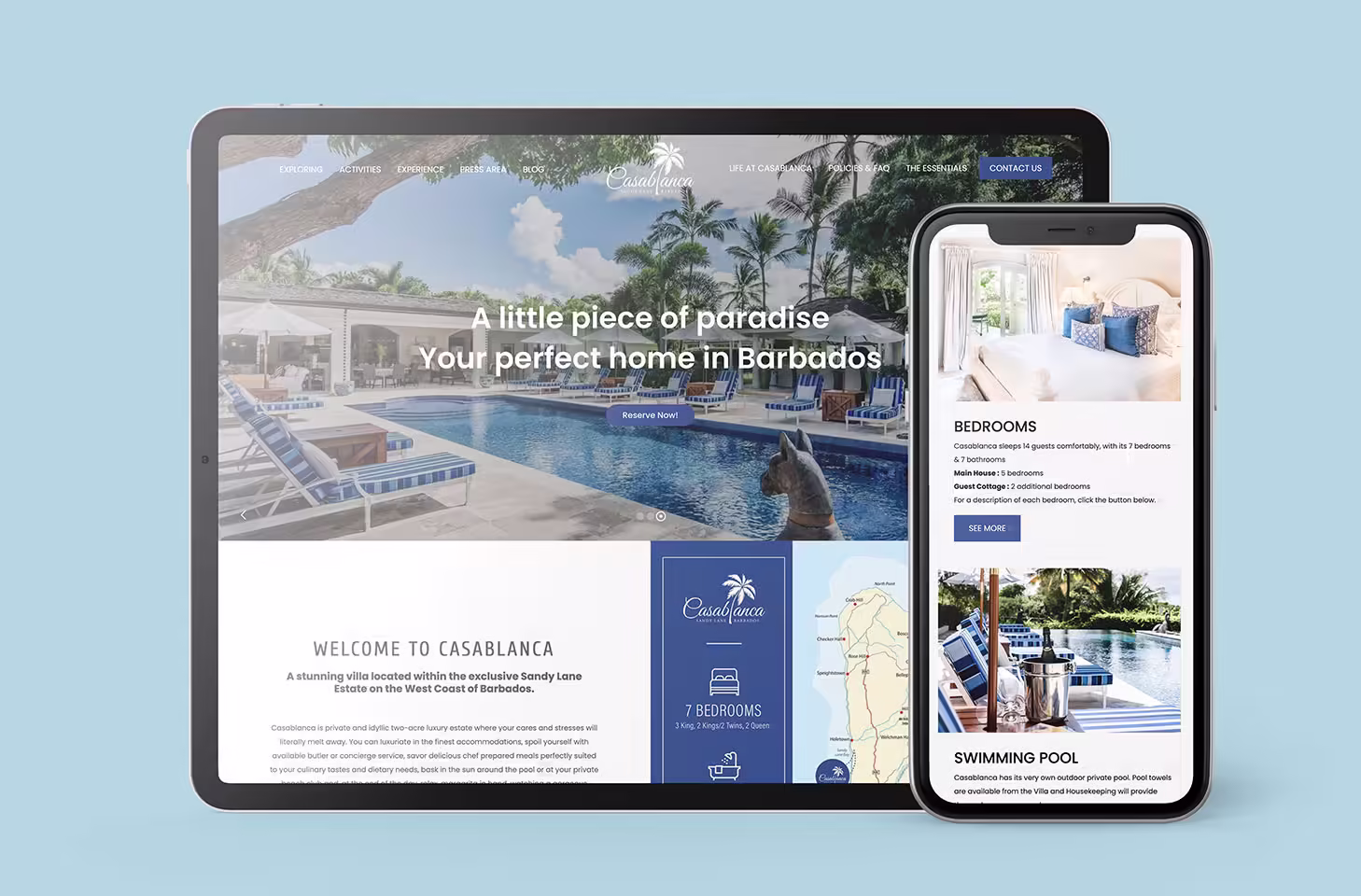
Our web design experts at Creative Coco’Nuts can craft a responsive website that is right for your brand, one that looks great on any device — mobile devices, tablets, laptops, and more.
Why is responsive web design important?

Users own hundreds of different devices and it’s impossible to design a website layout for all of them. Responsive web design means you don’t have to have hundreds of different layouts of your website. You only need one website, optimized with CSS code, flexible images, and fluid grids. More on this later.
The most important aspect of responsive web design is that it improves the experience your users have on your site. This translates into more conversions and greater business growth.
Your customers do not have unlimited patience when it comes to your site. Crowded text, strange fonts, and grainy photos will decrease the readability of your site and irritate your customers. Those issues can be fixed with responsive web design, which will space text evenly for the platform, keep fonts consistent, and optimize photos to fit the space and pixel requirements.
And, it’s important to keep in mind that more people than ever are using their phones for research, entertainment, and communication. In Canada, 43% of Canadians check their phone every 30 minutes, making it necessary to optimize your site for mobile phones.
How responsive web design works
Responsive web design is made up of a combination of HTML and CSS code.
HTML code controls the structure and content of a website, and CSS code controls the layout, design, and style of the website.
So, HTML structures the basic elements of a site: the header, the main body of content and the footer while CSS can be used to control the height, width, colour, and other design elements of a site.
Combining CSS with a technique called media query is ultimately what makes the website responsive. Media query checks the size of a viewport the website is being viewed on, determines if it is wide enough or too wide, and then executes the right code so that the content is adapted to fit the screen.
A style sheet can be used to determine what styles will appear on different sized screens. A main style sheet can define the colours, height, width, and other design elements for the default website layout, and this can easily be adapted into additional style sheets for different layouts.
Responsive web design techniques
There are many techniques that make up responsive web design. Here are two essential ones to get you started.
Fluid layout
Responsive web design also uses fluid layout to create the adaptable content.
Fluid layout looks at the percentage of available screen width and can increase or decrease the size of text, images, and spacing by looking at this percentage.
Flexbox layout
Flexbox layout is a way to format multiple elements without having to know the percentage of space the elements occupy.
Flexboxes can shrink to fit within screen requirements or expand to fill available space, making them more flexible than fluid layout techniques.
Responsive web design is made up of many different elements and it can get complicated. However, it is essential for a successful website.
Contact our team at Creative Coco’Nuts to get started on your brand’s own responsive web design today!
Visit our online portfolio today or contact us.
The expert designers of the Coco’Nuts’ studio are here to help!
Contact us by email at info@creativecoconuts.ca
Talk to you soon!
SOFTWARE WE LOVE
Adobe Creative Cloud*– For Graphic Design & Photo Editing
WEBSITE HOSTING COMPANIES WE LOVE
Host Armada – For Cloud and Dedicated Server Hosting
