If you had a couple minutes to spare and did one of those “logo quizzes” online, you were probably amazed at the high quantity of logos that you can instantly recognize.
As designers, we certainly can recognize as well that the branding behind those logos is impeccable. When it comes to marketing, it can only mean one thing: success, mission accomplished!
We’ve already talked about the importance of logos as an essential part of branding (GOOD BRANDING, AND HOW TO USE IT), but have you ever wondered how to actually make the perfect logo?
You already know that your logo and your brand are intimately linked to promote whatever it is that you’re doing. Your logo is the central part of your visual identity. You definitely want to hire professionals to develop such a crucial part of your business or non-profit organization.
Of all the design firms in Edmonton, Alberta, you can counts on Creative Coco’Nuts to help with logo design matters (WHAT CREATIVE COCO’NUTS CAN DO FOR YOU: BRANDING).
However, having a great logo design is not enough… Maintaining your image (thus your reputation) should also always be top of mind.
So let’s take an example of our own to take you through the ins and outs of logo design as it relates to some essential rules of branding.

Example – FCFA’s logo
SIMPLICITY AND UNIQUENESS
Our example, FCFA, is a federation of all the organizations that represent the different provincial and territorial organizations of French-speaking communities in Canada. As such, it is considered a spokesperson for all these communities.
Whether you’re looking for logo ideas for your community or corporate branding, you need to make an efficient use of colours and fonts for that instant recognition that we talked about earlier. It’s easy: the simpler the logo, the faster you’re going to recognize the brand.
How is the logo going to speak to you, with or without words? How is it going to speak about the brand? How is something simple, yet creative and unique, going to convey all your values or services?
Professional graphic artists know how colours work and how to use them. Your finished product will need to work in colours and in black and white as well.
So, let’s go back to our FCFA example…
You’ve already deducted that the bubble means spokesperson. All the colours in the bubble can be seen as symbols of the different communities that are connected together.
But, more importantly, if we take it to a simpler version, in black and white, you still get the same idea of connection and representation!
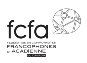
Now, let’s make it even simpler and take the words off:
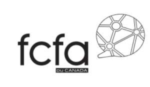
The core message and values are still there: FCFA is a spokesperson that connects and represents!
This is how a logo that looks simple, and is efficient because of its apparent simplicity, works with an array of symbols that a majority of people will understand and relate to. As all memorable logo designs, it stands out, it’s balanced and the size is just right.
But there is more. Once a logo is designed and developed, it needs to get out there and fly on its own, on prints, on websites, on social media platforms, etc.
CONSISTENCY AND GUIDELINES
Why is consistency so important?
Your logo represents your brand. A well designed logo will represent your brand well. Logically, if altered, it could lead to misrepresentation.
Here is one of the most essential rules of branding: Never ever should you compromise your brand!
Therefore, we developed a user guide for the FCFA’s logo that people using the logo will absolutely need to follow. This is something that we do, and that needs to be done, for all our logo designs, by the way.
WHAT TO DO
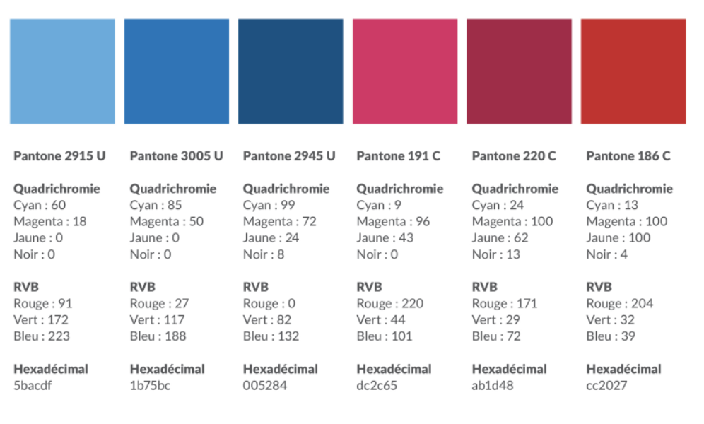
The guide gives the exact colours specification for reproducing the logo. It speaks of different printing or colour reproduction techniques (Pantone or hexadecimal code, printing with 3 or 4 colours) so that the logo is consistent. Always easily recognizable, always true to the brand.
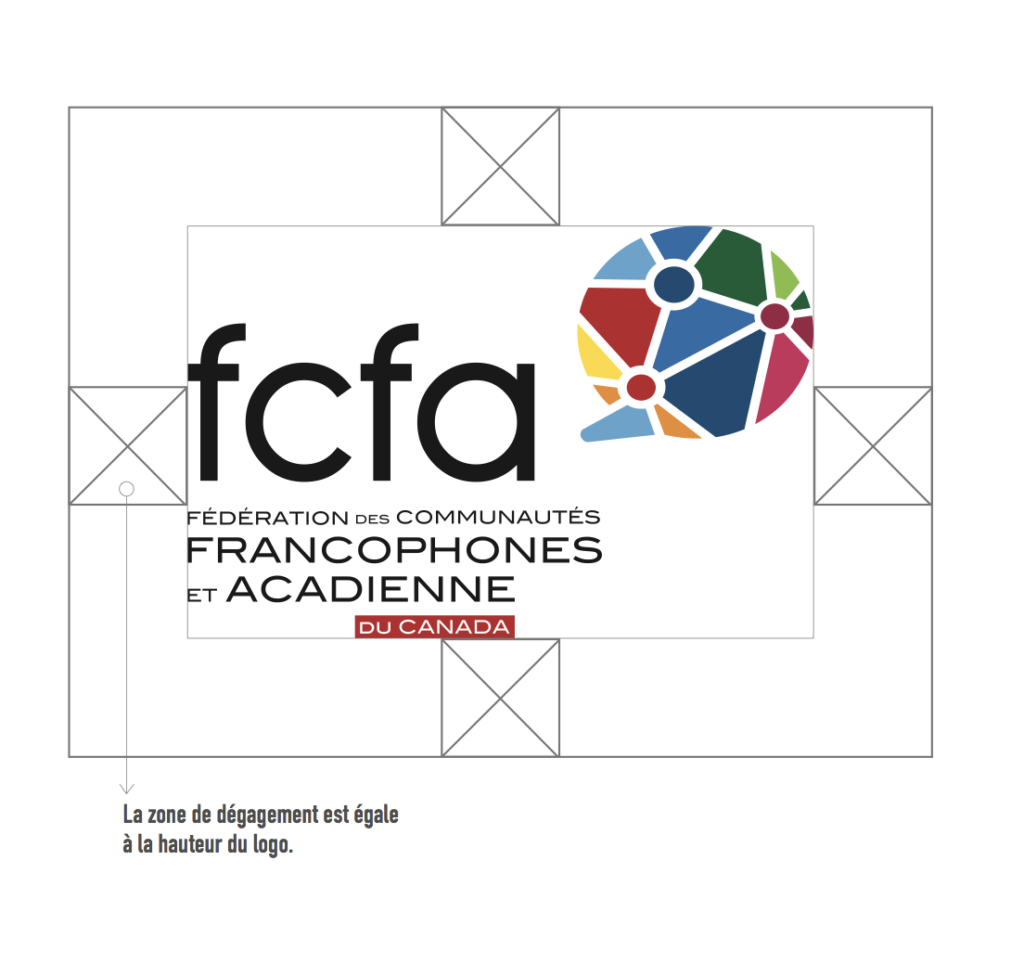
This very important document also talks about the right spacing, the acceptable versions and the one and only font for the logo. Once again, a well conceptualized logo must be here to stay and cannot be altered, just like your brand is here to stay and cannot be modified by anybody. On another hand, this is also the signature of our design studio, so we want to protect a work that we take pride in as well!
WHAT NOT TO DO
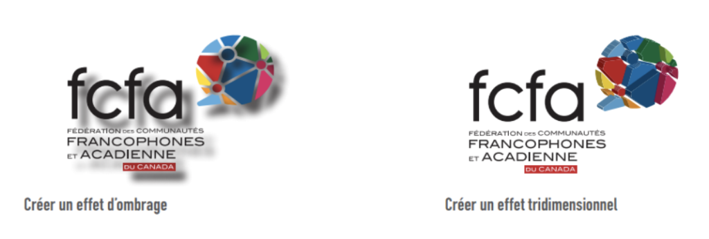
We don’t want the visual identity to be changed and we need to tell people what not to do to safeguard the integrity of our logos.
The user guide gives examples of incorrect uses of the logo. We want to show those errors to preserve our graphic design services, and always in the spirit of consistency. Similarly, you can’t have too many effects and filters, as you’ll want to avoid confusion and distraction.
If you’re looking for a studio in Edmonton that design logos, we do! Contact Creative Coco’Nuts by calling 780-909-5091 or by sending us an email at info@creativecoconuts.ca today.
We’ll help you design the perfect logo, develop the right branding solutions for you and protect your investment in the long term!

