Case Study: Casablanca Sandy Lane Barbados
Luxury, relaxation, paradise. Those are three adjectives that describe Casablanca, an exclusive Villa in Barbados.
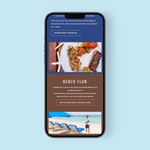
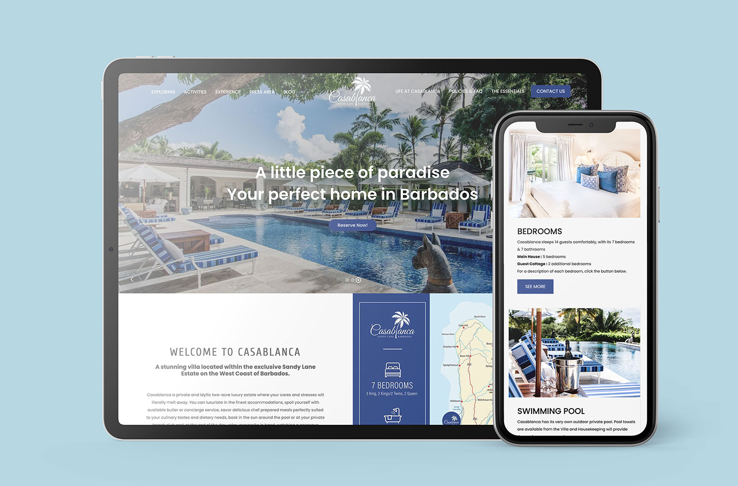
When creating a website for Casablanca, Creative Coco’Nuts focused on those core qualities of the Villa to give the website a similarly luxurious and relaxing feel. Scrolling through the website takes you on a tour through the Villa, and gorgeous full-colour pictures fill your screen. You almost feel like you’re right there, in paradise.

The simple but elegant font carries the thread of sophistication throughout the website, and the menu bar at the top of the screen allows for easy, painless navigation. You can easily find all the information you’re looking for in a matter of seconds.
The colour palate (navy blue and warm brown) subtly hints at the sand and the ocean that are key to a Bajan vacation. The colours are also inviting and easy to view, which improves user experience on the website.
Exploring tab
Clicking on the exploring tab allows users to get to know the Villa from the comfort of their own homes. The page details all the different rooms and amenities of the Villa, and additionally, it features image carousels to give users an even fuller picture of the space.
Activities tab
 This tab allows guests to get a head start on their vacation planning. It’s easy to click through the activity options and get a sense of what activities appeal to you. Clicking on the images provides additional helpful information for users.
Additionally, the page is broken up into two sections: activities to do at the Villa and activities to do in Barbados. This helpful breakdown allows users to find what they’re looking for in a short span of time. And then they can put more energy into vacationing, instead of vacation planning.
Experience tab
 The experience tab provides a variety of options for guests. It lays out how the Villa can be used for vacations, special events like weddings, and for work retreats. It also gives users a sense of the atmosphere at the Villa by describing the staff and food scene.
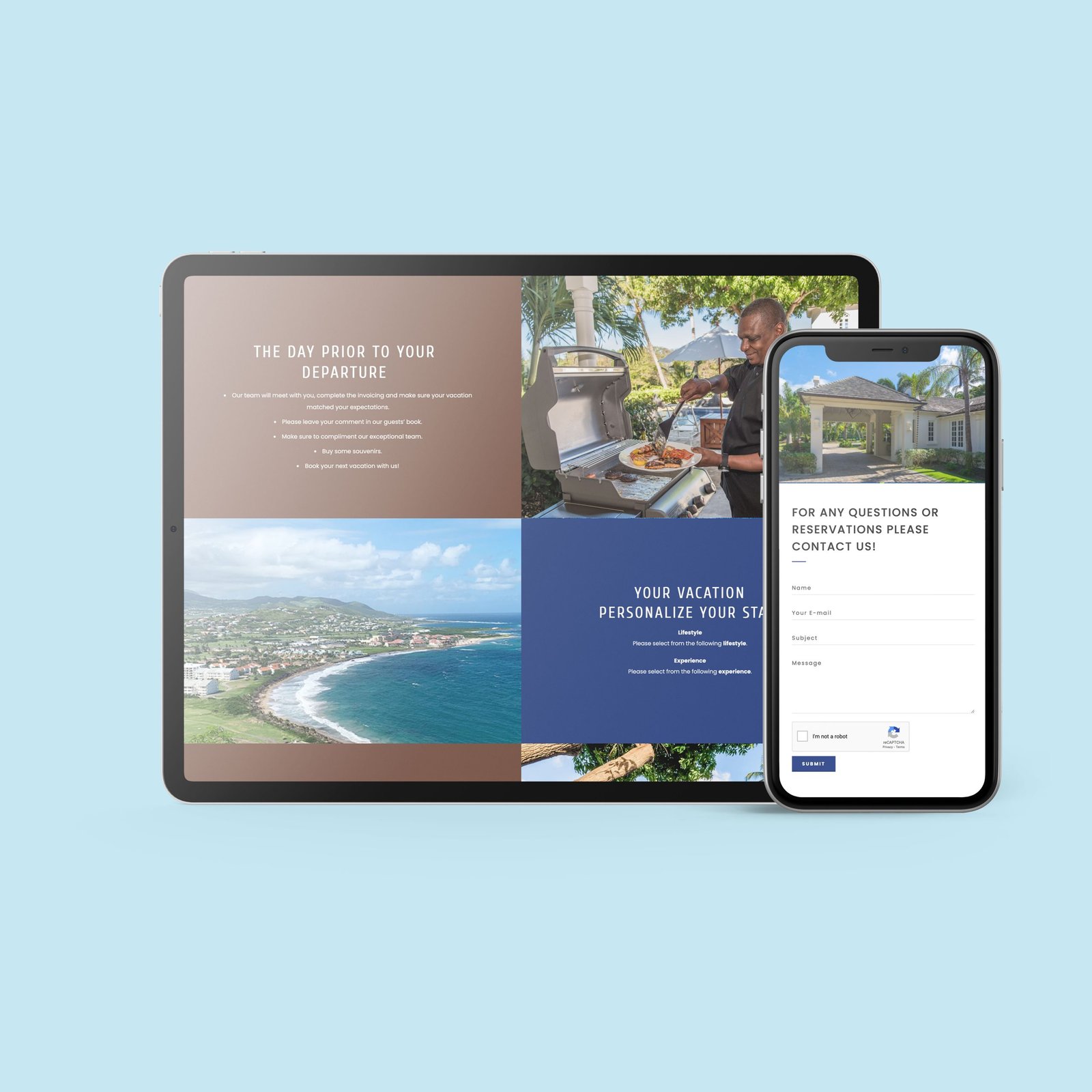
The page is split into two halves, and pictures and text alternate on the page. This creates a fluid and engaging reading experience.
These three tabs mentioned here are featured on the left side of the website and help users gain an understanding of the experience Casablanca provides. The tabs on the right side of the website provide logistical information to help users plan a vacation to Casablanca. This split between the tabs contributes to a positive user experience and provides ease of access.
Life at Casablanca tab
This tab is a helpful overview of what a vacation at Casablanca will look like. It lets guests know what to expect and what to prepare for. This page is broken up with alternating squares of text and photos, like the experience tab, creating an easy flow.
Policies and FAQ
This tab makes it easy to find need-to-know information at the drop of a hat. Users can access the drop-down menus to find the answers to their questions. When they click on a new drop-down menu, the one previously open automatically closes. This ensures that users aren’t bombarded with an overload of information all at once.
Essentials tab
This tab is interactive! It includes a packing checklist that guests can print off. They can even click off items directly on the website. This section provides additional information not found in the FAQ.


