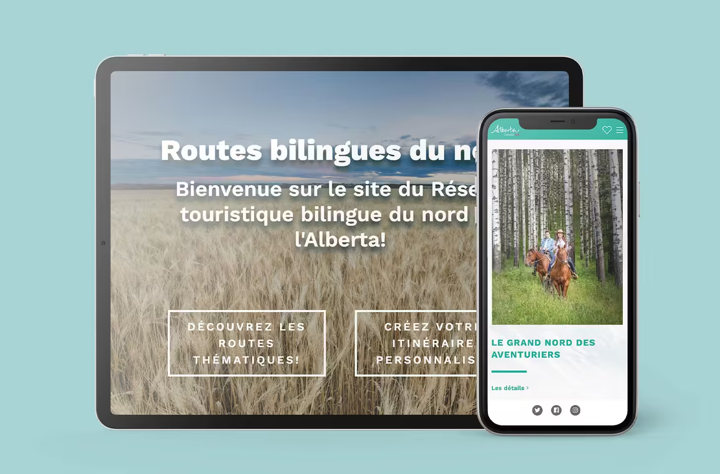
Creative Coco’Nuts was tasked with developing a website for Tourisme Alberta — one that reflects the incredible experiences people can have exploring the best that Alberta has to offer. The finished website features interactive web design that creates the ideal user experience, and an attractive layout and design that reflects the Tourisme Alberta brand.

Additionally, the website has been optimized and redesigned for mobile view as well.
Users can choose to view the site in French or English, allowing for ease of access. Additional interactive features include the “Bilingual Routes of the North” page and “Personalized Itinerary” page.
But most importantly, the site combines the user friendliness with an aesthetic design and the latest SEO trends.
 Vibrant turquoise pops of colour act as a unifying element on every page. The same shade is used in the Tourisme Alberta logo.
Images are also used to create visual interest and engage users. At the top of the home page, images zoom out as users scroll through, to give the impression of the real scale of the Rockies. It almost feels like you are right there, overlooking the Rockies with the hikers in the photos.
Videos also feature front and centre on the home page so viewers can have a more detailed look into the Alberta attractions they are interested in.
But some of the most recent interactive elements feature on the following pages:
Bilingual Routes
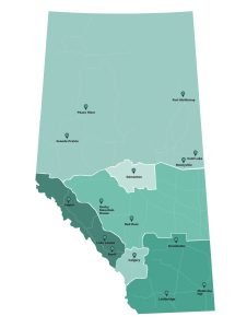 On the “Bilingual Routes” page, users can choose between different recommended travel itineraries. This is great for users who might feel a bit overwhelmed by the many Alberta tourism options.
Here, users can choose a tourism option based on their interests. For instance, users can select “In the Heart of Indigenous Traditions,” “Plant and Wildlife Expedition,” “Regional Flavours,” or “Great North Adventures” — just to name a few examples.
When users click on these features, they can see approximately how many days the experience will take, the number of attractions involved in the experience, a map of the route, and more information about the various attractions themselves.
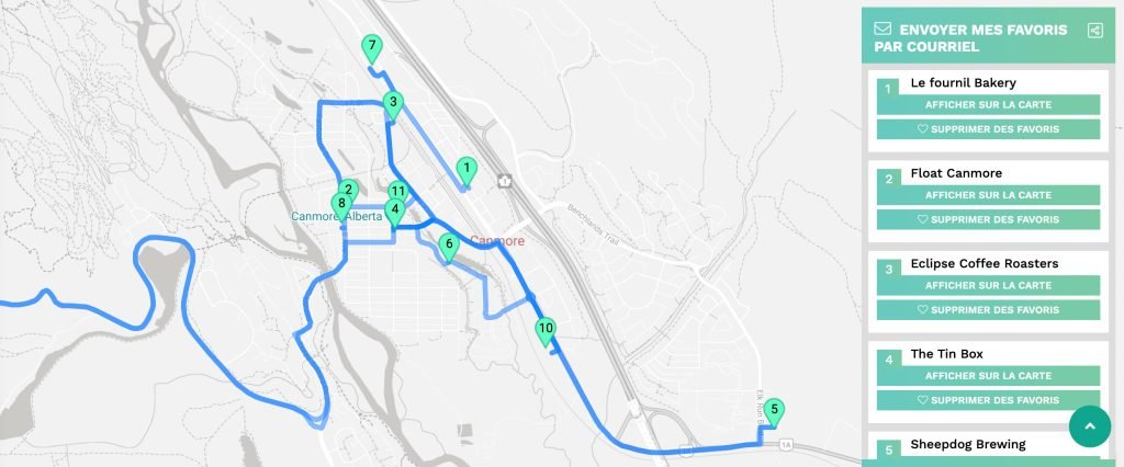
The map is scrollable, zoomable, and clickable, images accompany the text, and users can even download directions from the site.
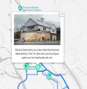 And, on top of user experience and an interactive design, the page is designed to fit into the overall brand and aesthetic of Tourisme Alberta with the turquoise accents, homey sans-serif font, and structure.

Personalized Itinerary
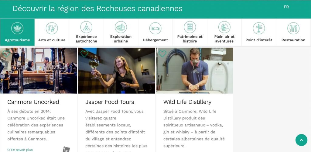
On the “Personalized Itinerary” page, users can customize their own itinerary based on more than 500 different provided attractions that are available in the Tourisme Alberta database — interactive website design at its finest.
Attractions are broken up into several different categories for ease of access (Arts and Culture, Food and Drink, Heritage and History, and Indigenous Experience for example), and users can scroll through the various options.
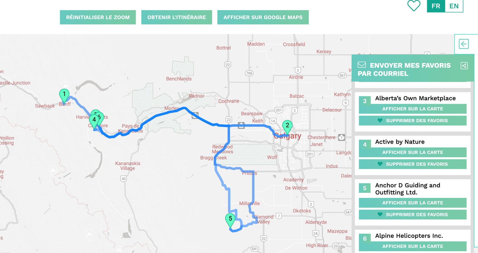
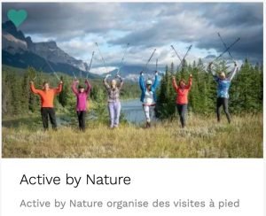 Users can “favourite” the attractions they are interested in by clicking on the heart icon, and they can access these attractions later on the “favourites” page. There, the site will map will plot a route for them between the attractions they are interested in.
General site goals and features
 Our web design team at Creative Coco’Nuts consulted with Tourisme Alberta to fully understand what they were looking for in a website.
User experience, interactive website development, and an engaging aesthetic were all important for this project.
Maps were formulated to be accessible and interactive for users, attractions are outlined in an easy-to-understand format with more information easily accessible, and the countless options of the Personalized Itinerary page make it easy to visualize an Alberta full of a users’ own unique interests.
But highlighting the diverse and multi-faceted experiences and attractions in Alberta was central to the project. Alberta is adventurous, outdoorsy, full of culture and good food, and ready to explore. All of this was reflected through the website programming.

