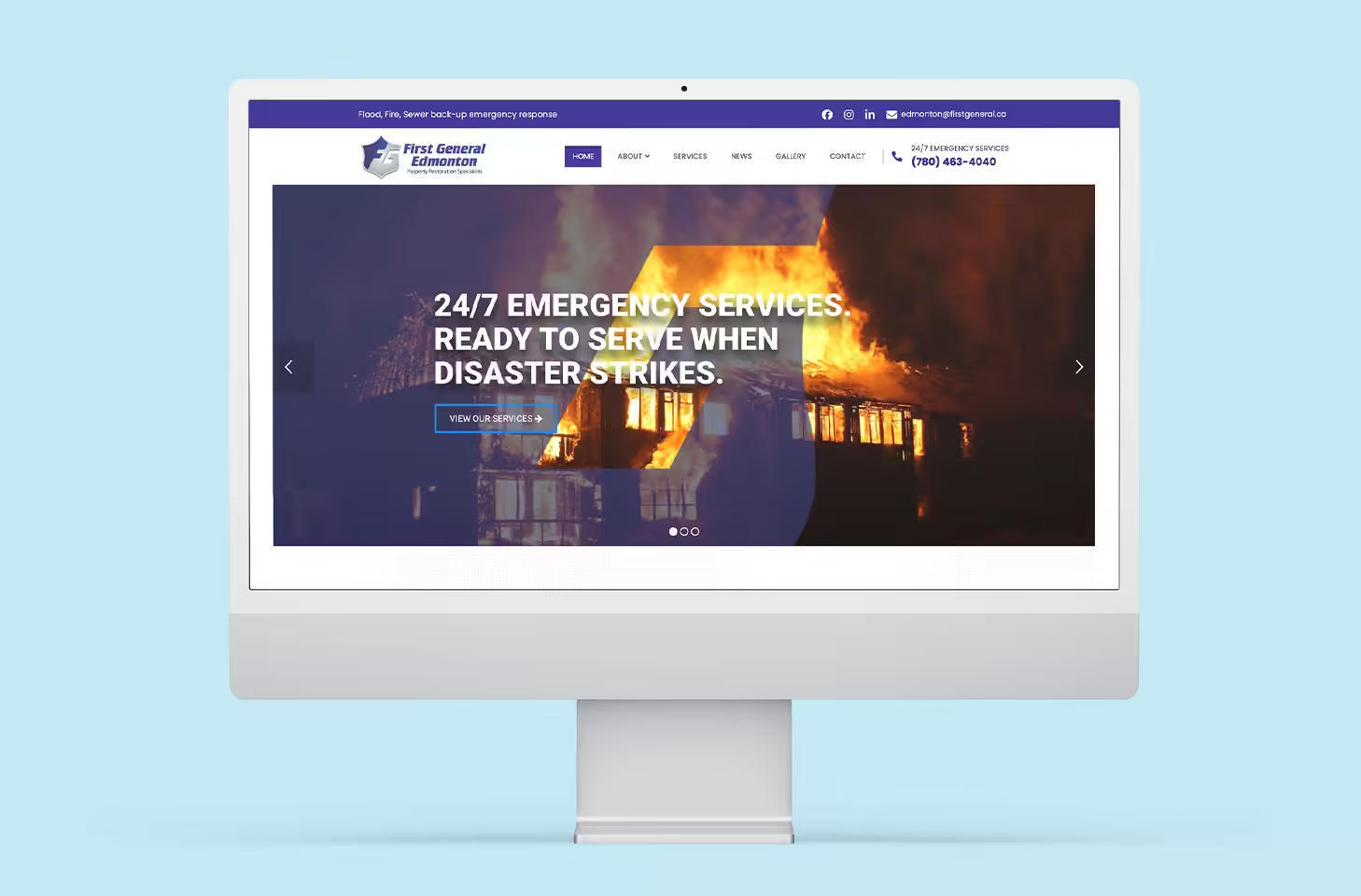
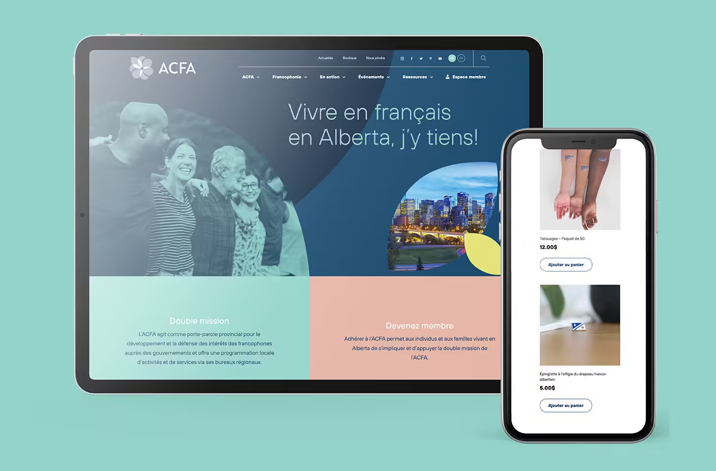
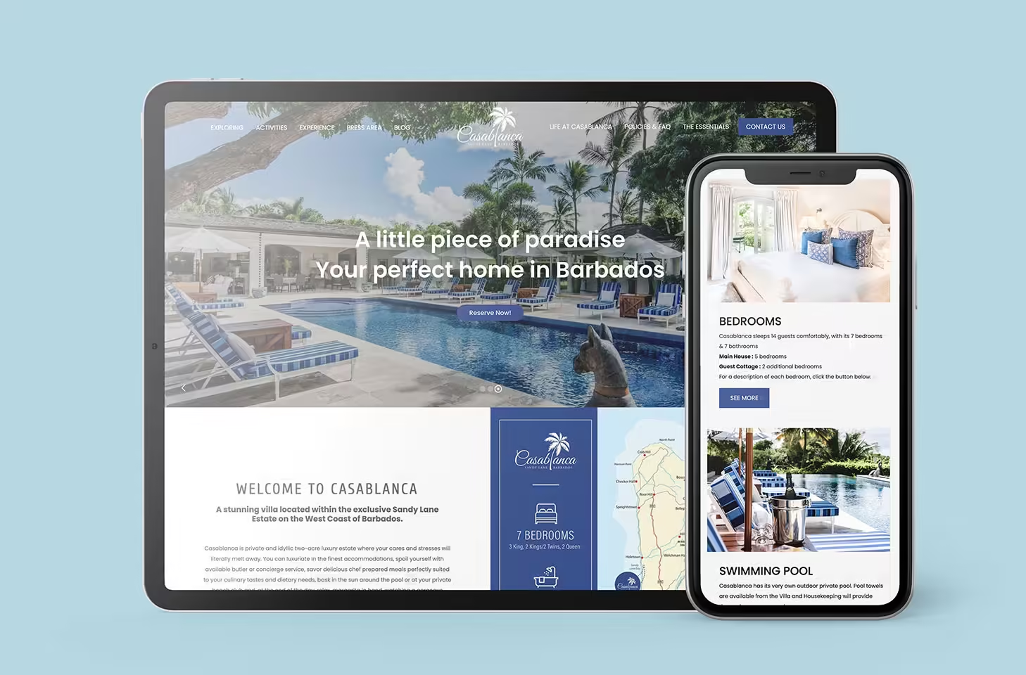
Responsive web design is more important than ever. If your audience can’t view your content in a clear and engaging way, they will quickly lose interest.
This means that your website has to be optimized to fit and work well on any platform that your customers might be using.
With responsive web design, our web design team at Creative Coco’Nuts will make sure your content can be viewed on a variety of sites and platforms with no hiccups.
How is this possible?
This article will introduce you to CSS media queries, which are a great strategy for creating adaptable and responsive website content!
What are media queries?
 CSS media queries modify the layout and style of your website depending on the viewport size of a device, or specific information like screen resolution, device orientation, or even operating system on a specific device.
This tailoring of your website content means that your customers will be able to view an optimized version of your website on any device.
Media queries let you create different orientations and layouts of your website content that will be displayed depending on what device they are viewed on. For example, media queries can detect if a device is being used as a touchscreen or with a mouse and adapt your website content to be accessible to either of those situations.
What goes into a media query?
 Media queries include three major parts: a media type, a media expression, and CSS rules.
A media type is used to tell whether the website content was intended to be viewed on a screen or in a print preview format. If a document is being printed, then a CSS media query would apply formatting rules for a printed document. For example, the font could be changed to Times New Roman and size 14. But, this would not change the document being viewed online.
A media expression is a CSS rule that is tested for. If this rule is found to be true, then the CSS is applied. For example, if a media query does a test to see what orientation a device is being used in and determines that the device is in landscape mode, then the CSS rule for landscape layout and formatting would be applied.
CSS rules are used to determine when a layout or formatting option should come into effect. One CSS rule might be that for viewports that are 600 pixels tall, CSS would change a three-column block of text into a single column instead.
Media query features
Minimum and maximum features: Minimum and maximum features allow CSS to be applied for a range of different viewport sizes. For example, you can set up a website layout for viewport screens that are between 600 and 800 pixels. The same layout would be deployed for any screens that meet this criteria.
Hover: Media queries can test if the device has any ability to hover over items. If the answer is yes, CSS can apply the hover mechanism in the website.
Resolution: Media queries look at the pixel density of the device to determine how images, text, etc. should appear onscreen.
Orientation: The orientation feature allows you to change the colour of your website text and website background, change the layout of your website, change the size or type of font, and more, depending on the orientation of the device. Media queries test for orientation and deploy CSS depending on whether the device is in landscape or portrait mode.
More media queries
To create the overall layout design you’re looking for in your website, our web designers will have to use more complex media queries.
This means incorporating logical operators into content.
Logical operators are the words “and,” “not,” and “or” that are included in media queries.
“and”: Using “and” in media queries combines a media type (screen or print) with a media feature (min/max values, resolution, etc.).
“not”: This can be used to prevent an action from happening. Using “not” can make sure that text is in Calibri font unless the device is in landscape orientation, for example.
“or”: This one is a bit trickier. Say, for example, you want the text of your website to be bolded when a device is in landscape orientation OR when a user zooms in on the text. “Or” logic lets you accomplish this, and CSS will be deployed to accomplish this task if either of the above rules are considered true.
Commas: Using a comma in media queries combines different media queries into one rule. This means that if the media query discovers any of the listed features connected by commas on the user’s device, the entire rule will be found to be true.
Media queries are a great way to accomplish responsive web design and create a website your audience will be able to view on any screen. Our knowledgeable web designers across Alberta can help you craft a website that will captivate your audience.
Contact our team at Creative Coco’Nuts to get started on your brand’s own responsive web design today!
Visit our online portfolio today or contact us.
The expert designers of the Coco’Nuts’ studio are here to help!
Contact us by email at info@creativecoconuts.ca
Talk to you soon!
SOFTWARE WE LOVE
Adobe Creative Cloud*– For Graphic Design & Photo Editing
WEBSITE HOSTING COMPANIES WE LOVE
Host Armada – For Cloud and Dedicated Server Hosting
